For two decades, most business advice about the paradox of choice has pointed in one direction: offer less.
The famous jam study showed 24 varieties = 3% conversion, 6 varieties = 30% conversion. The lesson seemed clear. Trader Joe’s built an empire on 4,000 SKUs instead of the typical grocery’s 50,000. Capsule wardrobes, curated collections, limited menus—constraint became the answer to choice overload.
But there’s another solution, one that’s in recent years become more scalable than ever: keep the abundance, add intelligent navigation.
You don’t have to choose between catalog depth and customer ease anymore. Not if you’re willing to invest in curation.
Netflix has 15,000+ titles. That’s not the problem. The problem is sitting down to watch “something” and browsing for 2 hours until you’re too tired to watch anything. The catalog is valuable. The navigation is exhausting.
Your customers keep asking for more options. More features. More variety. So you deliver. Then engagement declines. People browse longer but buy less.
Here’s what I’m seeing across industries in the last 12 months—brands that built massive catalogs are now adding navigation layers to make them usable:
Pelotonspent years building a massive library—pilates, yoga, cardio dance, strength, meditation, scenic rides. That expansion was the right move. The library is a competitive advantage. But opening the app to thousands of options creates paralysis. So they added navigation layers.
The recently launched Hi-lit offers pre-programmed workout series—choose once, then just follow the sequence. More broadly, Personalized Plans use AI to generate weekly schedules based on your goals—set preferences once, get curated plans every Monday. Both eliminate the daily “what should I do today?” decision while keeping the full library available. As one member described it: “No overthinking. No burnout. No decision fatigue. I open the Peloton app. I follow the weekly plan. And I move.”

Instacartlaunched Smart Shop in March 2025. With 17 million items, they didn’t reduce SKUs—they added navigation layers. The AI learns your preferences automatically, surfaces personalized carousels with 14 dietary filters, and creates Inspiration Pages with curated recipes and products. This is personalization without pestering. The full grocery catalog remains available. You just get a curated entrance based on how you actually shop.
In addition to the personalization aspect we discussed in a previous edition, Instacart created curated “inspiration pages” including a collaboration with the American Diabetes Association, as well as shoppable experiences for Smart Shop preferences like high fiber and high protein, and plans to partner with additional organizations to bring more expert-backed guidance onto the platform

DoorDash launched their Zesty app (beta in SF and NYC, January 2026) that transforms how you navigate restaurants. Instead of scrolling through 500 options, you type hyper-specific prompts: “cozy pasta spots on the Lower East Side with outdoor seating under $100”. The AI pulls from DoorDash, Google Maps, TikTok, Reddit, and social connections to surface relevant options. Full catalog. Simplified navigation.

As James Clear writes in Atomic Habits: “Every action requires a certain amount of energy. The more energy required, the less likely it is to occur. If you want to increase the odds that a behavior will occur, then you need to make it easy.”
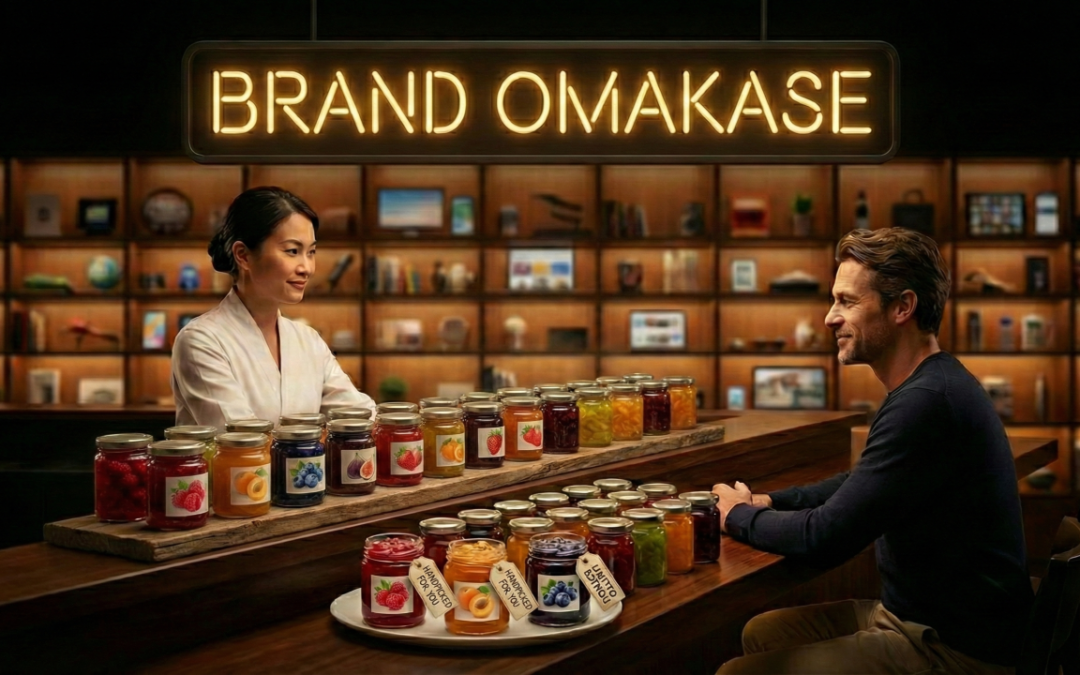
This is brand omakase—customers surrender navigation decisions in exchange for curated experiences. But like restaurant omakase, it only works when three conditions are met: the brand has expertise to curate well, deep understanding of individual preferences, and a track record that earns trust. You’re asking customers to say “you choose for me”—which requires proving you’ll choose better than they would themselves.
Two Different Solutions
There are two ways to solve decision fatigue:
- Approach 1: Limit the catalog (Trader Joe’s with 4,000 SKUs vs. typical grocery’s 50,000)
- Approach 2: Keep the catalog, add navigation layers (Netflix, Spotify, Peloton, Instacart)
Both work. But Approach 2 is increasingly viable for digital products where catalog expansion costs are low and variety creates value.
The Hidden Cost of Navigation
Every unguided decision point adds energy cost. Every energy cost is a potential exit point.
When Spotify’s DJ plays songs automatically, users aren’t just listening longer—they’re coming back more often because the barrier to starting disappeared. When Instacart auto-populates dietary preferences, they’re eliminating the scroll-filter-compare loop that makes people abandon carts. When DoorDash’s Zesty transforms “scroll through 500 restaurants” into “describe what you’re in the mood for,” they’re removing dozens of micro-decisions.
When you systematically add these navigation layers, you don’t just get more conversions—you get customers who feel calmer, more loyal, and more willing to pay for that relief.
What This Means for You
If you’re sitting on a large catalog, content library, or product portfolio:
- Are we confusing catalog size with catalog usability?
- Does every session require customers to re-navigate our full offering?
- Are we building more while making existing value harder to access?
The most valuable thing you can offer an overwhelmed customer in 2026 isn’t fewer options. It’s a clearer path to the right option.
The competitive advantage is shifting from selection to navigation. Not “look how much we have” but “look how easily you can find what matters.”
In The Joy Dividend, this shift is one expression of what I call the Calm Advantage—minimizing mental and emotional strain at every touchpoint to build trust and loyalty through emotional relief.
The brands that will win aren’t asking “what can we add to our catalog?”
They’re asking “how do we eliminate navigation friction from our customer’s journey?”
Keep building your library. Just stop making customers navigate all of it every time.
Where is unguided abundance creating friction in your customer experience?
P.S. If you’re seeing decision fatigue in your funnel—high browse-to-cart ratios, low completion rates, customers who engage but don’t convert—The Joy Dividend gives you a step-by-step framework to map those friction points and redesign them into Calm Advantage moments. The Joy-Stress Audit (Chapter 7) helps you identify exactly where cognitive load is killing conversion. Sample the Audit here.